Conditional formatting in Excel allows users to visually format cells based on specified conditions. While Microsoft Excel seamlessly integrates formatting with icons, providing enhanced and visually appealing spreadsheets, Google Sheets lacks this cool native feature.
Although we cannot create the icon in the same cell like Excel Sheet but we can achieve similar results with image formula in Google Sheet
How it Works
The image formula helps to render an image form a url which plays the major role rendering the icon.
=IF(logical_expression, value_if_true, value_if_false)
=IMAGE(url, [mode], [height], [width])
You can upload the image to any 3rd party server or cloud and just use the url in the formula
=IF(A3<50,IMAGE("your_icon_url",3),IMAGE("your_icon_url",3)) The above formula will render any one of the two images based on the condition A3<50. You can even use nested IF when you have more than 2 conditions. Here is an example:
=IF(D2="Yes",IMAGE("your_icon_url",3),IF(D2="No",IMAGE("your_icon_url",3),IMAGE("your_icon_url",3))) The above formula will show three different icons based on the cell value "Yes", "No" and "Maybe". Here is a Demo Spreadsheet where you can see it all live.
Change Icon Size
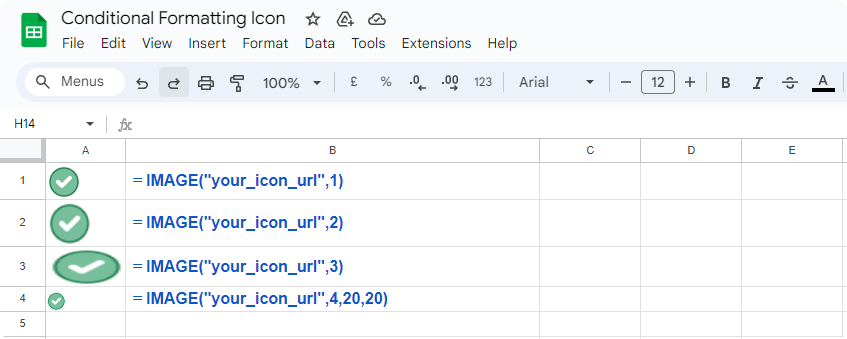
The =IMAGE("your_icon_url", 2) formula accepts a 2nd parameter which sets the size mode.
| Options | Example |
| Size to fit | =IMAGE("your_icon_url", 1) |
| Stretch to fit | =IMAGE("your_icon_url", 2) |
| Original size | =IMAGE("your_icon_url", 3) |
| Custom size | =IMAGE("your_icon_url", 4, height(px), width(px)) |
Put the Icon and Value in the Same Cell
In Google Sheet it is not possible to put the icon and value in same cell similar to Excel sheet, however there is a workaround. We can put the text and the icon side by side and have right the border same as the background.![]()
Formatting with SPARKILINE
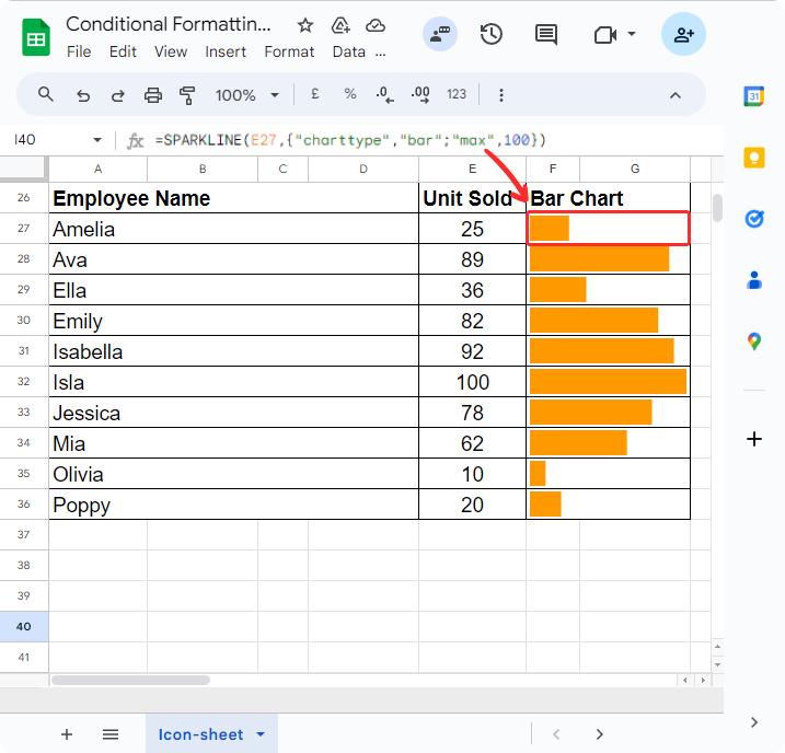
Sparkline is a cute feature available in Google Sheets, designed to create tiny bar charts directly within cells. These tiny, in-cell charts provide a quick overview of data variations, making it easier to interpret large datasets at a glance.
=SPARKLINE(E2,{"charttype","bar";"max",100})SPARKLINE Syntax
=SPARKLINE(data, [options])- data - The range or array containing the data to plot.
- options - [ OPTIONAL ] - A range or array of optional settings and associated values used to customize the chart.
Sample Usage
SPARKLINE(A1:F1)

SPARKLINE(A2:E2,{"charttype","bar";"max",40})

SPARKLINE(A2:E2,A4:B5)

SPARKLINE(A1:A5, {"charttype","column"; "axis", true; "axiscolor", "red"})

